

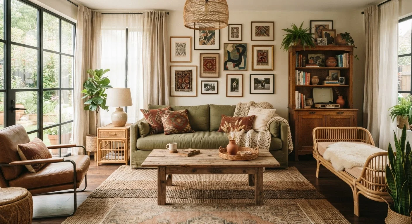
Why the Matchy-Matchy Habit Is So Hard to Break
The instinct to match everything in a room comes from a reasonable place: when you're uncertain, a complete set feels like a decision already made for you. Furniture showrooms reinforce this by displaying pieces together, and it's easy to assume that's the only way they're meant to live. But rooms decorated entirely from one collection tend to look like a catalog page — pleasant, but impersonal and lifeless.
The rooms people genuinely admire — the ones that feel layered, warm, and specific to whoever lives there — almost never came from a single shopping trip. They developed over time, with pieces of varying ages, origins, and finishes that happen to share a color story. That's not an accident; it's a method. If you're ready to explore what drives that layered aesthetic more fully, our guide on layering décor principles breaks it down step by step.
Below are the most common matchy-matchy mistakes — and the specific moves that will take your room from coordinated to compelling.
Buying a complete matching furniture set to 'play it safe.'
Why it happens: Furniture sets feel like a guaranteed outcome — everything already coordinates, so there's no risk of getting it wrong. Many shoppers default to them when they feel uncertain about their own design instincts.
Using the same finish on every wood surface in the room.
Why it happens: Conventional advice about 'consistency' gets misapplied. Readers assume all wood tones must match when, in practice, two or three complementary wood tones layered together read as far more sophisticated.
Choosing throw pillows, rugs, and curtains all in the exact same color.
Why it happens: It feels safe to repeat one color throughout soft furnishings. The goal is harmony, but the result is flatness — the eye has nowhere interesting to travel.
Treating every item in the room as equally important.
Why it happens: When every piece was chosen carefully, it feels unfair to let any one of them recede. But a room where everything competes for attention is visually exhausting, not curated.
Avoiding pattern because it seems harder to control.
Why it happens: Pattern mixing has a reputation for going wrong, so many people skip it entirely and end up with rooms that feel flat and forgettable.
Keeping décor symmetrical because it feels 'balanced.'
Why it happens: Symmetry reads as order, and order feels safe. But strict bilateral symmetry — two identical lamps, two identical nightstands, two identical plants — tends to feel more like a showroom than a home.
How to Build Cohesion Without Uniformity
Once you start releasing the grip on matching, the question becomes: what actually holds a room together? The answer is nearly always a consistent color palette, not identical pieces. Pick two or three colors that genuinely appeal to you, then look for them — in varying shades and materials — across every surface in the room.
Cohesion Comes from Color, Not Matching
The single most effective way to unify a room with mixed pieces is a consistent color palette — typically two to three anchoring colors repeated across furniture, textiles, and accessories. When the palette holds, the eye reads the room as intentional regardless of whether the sofa and coffee table came from the same store or the same decade.
Textiles are your most flexible tool here. Rugs, curtains, and throw pillows can be swapped seasonally and are usually far less expensive than furniture, so they're the ideal place to experiment with pattern and contrast. Our guide to textile choices covers exactly how to layer soft furnishings for warmth and scale.
Before you go shopping for anything new, it's also worth stepping back to assess what you already have. Our room refresh checklist walks you through what to reassess first — rearranging and editing often do more than new purchases. And if your space is on the smaller side, see how these principles apply in our piece on decorating a small living room without it feeling cramped.
Secondhand pieces are also worth considering — a vintage side table or inherited lamp in a contrasting finish can be exactly the element that keeps a room from looking too new and too safe. See what to look for (and what to leave behind) in our coverage of secondhand furniture in a modern home.