

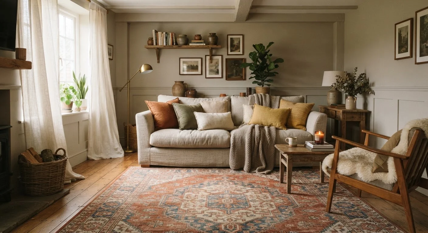
Why Textiles Matter More Than You Think
Furniture gets most of the credit, but textiles do an enormous share of the work in making a room feel finished, warm, and cohesive. Rugs define zones. Curtains frame light and control scale. Throw pillows introduce color, pattern, and personality without commitment. Together, they form the soft layer that makes hard surfaces livable.
The good news is that textiles are among the most flexible and forgiving elements in a room. They can be swapped seasonally, layered progressively, and adjusted without renovation. Understanding how each one functions — independently and together — is the foundation of confident decorating. This guide covers exactly that, for anyone starting from scratch or refining what's already there.
If you want to understand how textiles fit into the broader principle of building a layered room, the article on layering décor is a useful companion read.
Choosing the Right Rug: Size, Material, and Placement
The single most common rug mistake is choosing one that's too small. A rug that floats in the center of a seating area — with furniture legs hovering off the edges — fragments the space rather than unifying it. The standard guidance: in a living room, all front furniture legs should sit on the rug, or all four legs of each piece if the room allows.
Flat-weave rug
A rug with no pile — woven flat rather than tufted or knotted. It lies low to the ground, is easy to clean, and works well in high-traffic areas or layered under another rug.
Rug pile
The thickness and density of a rug's surface fibers. Low pile is flat and easy to clean; high pile (like shag) is plush but harder to maintain.
Blackout lining
A dense fabric layer sewn into the back of curtain panels that blocks light from passing through. Used in bedrooms or any room where light control matters.
Lumbar pillow
A rectangular throw pillow, typically wider than it is tall. It's commonly placed in front of square pillows to add a finishing layer and provide lower back support when sitting.
Color family
A group of colors that share a common undertone or hue — such as warm neutrals (cream, tan, rust) or cool blues (navy, slate, teal). Using colors from the same family creates cohesion without an exact match.
Rug pad
A thin layer placed between a rug and the floor to prevent slipping, protect hardwood or tile surfaces, and add cushion underfoot.
In a bedroom, a rug should extend at least 18 to 24 inches beyond the sides of the bed so bare feet land on something soft in the morning. Under a dining table, the rug should be large enough that chairs remain on it even when pulled out.
Material matters for longevity and feel:
- Wool — durable, naturally stain-resistant, and soft underfoot; a reliable choice for living rooms
- Polypropylene (synthetic) — easy to clean and weather-resistant; practical for entryways, kitchens, or outdoor-adjacent spaces
- Cotton flat-weave — lightweight and washable; works well in casual rooms or layered under a larger rug
- Jute and sisal — textural and natural-looking, but rough underfoot and harder to clean; better in low-traffic or accent positions
Rug pads are worth the investment regardless of material — they prevent slipping, protect flooring, and add cushion underfoot.
Curtains: Height, Weight, and What They Do to a Space
Curtains function simultaneously as light control, insulation, privacy screens, and — perhaps most powerfully — architectural tools. The placement of the rod alone can visually reshape a room.
Hang rods close to the ceiling rather than at the window frame. This elongates walls and draws the eye upward, making rooms feel taller. Curtain panels should reach the floor; anything that stops noticeably short tends to look accidental rather than intentional. A slight graze or modest puddle at the floor reads as polished.
Panel width is equally important. For a full, gathered look when closed, panels should total roughly two to two-and-a-half times the width of the window. Curtains hung with too little fabric lie flat and thin — they look incomplete and don't block much light.
For light and function, consider fabric weight:
- Sheer or linen blends — allow soft, diffused daylight; ideal for living spaces where privacy isn't critical
- Mid-weight cotton or velvet — balance light filtering with structure; suit bedrooms and dining rooms
- Blackout-lined panels — best for bedrooms, nurseries, or media rooms where light control matters most
Color and pattern in curtains have an outsized visual effect since they cover a large vertical surface. Solid curtains in a tone slightly deeper than the wall color add quiet depth. Bold patterns read as a focal point — use intentionally.
Throw Pillows: The Finishing Layer
Throw pillows often get dismissed as superficial, but they're one of the most practical decorating tools available. They introduce color and pattern in a way that's entirely reversible, and they signal the visual style of a room at a glance.
The Chop Test for Pillow Inserts
A well-filled pillow should hold a 'karate chop' indent in the center — the classic styling technique used in interior photography. If your pillow flops flat when chopped, the insert is too small or too thin. Swap it for a down or down-alternative insert one size larger than the cover for a full, structured look.
A few principles make pillow styling straightforward:
- Vary scale — combine at least two different sizes (e.g., 22-inch squares with a 14×20 lumbar) for visual interest
- Mix textures — pair smooth with nubby, or woven with velvet; different materials catch light differently and add tactile richness
- Keep color connected — pillows don't need to match each other, but they should share at least one color with something else in the room
- Use odd numbers — groupings of three or five tend to look more natural and relaxed than symmetrical even pairings
Insert quality matters as much as cover design. A pillow stuffed with a thin or mismatched insert looks deflated and cheap regardless of the fabric. Look for inserts slightly larger than the cover size (e.g., a 20-inch insert in an 18-inch cover) for a full, plump result.
For bedroom-specific pillow and textile guidance, see the article on bedroom décor.
Layering Textiles Together Without Chaos
The goal when combining rugs, curtains, and pillows isn't uniformity — it's coherence. A room where every textile matches exactly tends to feel flat and staged. A room where textiles share a color family or a common thread (literally or visually) feels layered and lived-in.
A practical approach: start with one anchor textile — often the rug — and use its colors and tones to inform what you choose for curtains and pillows. You don't need to extract every color, but pulling one or two tones ties the room together without forcing a match.
Pattern mixing is approachable when you vary scale: a large-scale geometric rug can coexist with a small-scale stripe on a pillow if they share a color. The matchy-matchy approach is actually one of the most limiting habits in home decorating — contrast is what creates depth.
Texture variation matters as much as color. A room with a jute rug, linen curtains, and a velvet pillow reads as layered even if the palette is simple. Don't underestimate the role of material contrast in making a space feel considered.
If you're working with existing furniture — including secondhand pieces — textiles are often the most efficient way to unify pieces that weren't originally bought together. A shared rug grounds a mixed collection; coordinated pillow tones pull different upholstery colors into the same visual conversation.