
What an Accent Wall Is Actually Supposed to Do
An accent wall — one surface treated differently from its three companions through paint, wallpaper, wood paneling, stone, or tile — is meant to direct the eye and anchor a room. The idea is that by drawing attention to one wall deliberately, you create a sense of purpose and depth that flat, uniform color alone can't deliver.
Used correctly, it functions like the spine of a room's visual identity. Used carelessly, it simply looks like someone ran out of paint or couldn't commit to a decision. The difference between those two outcomes comes down to a handful of specific conditions — and it's worth understanding them before rolling anything onto a wall.
For a broader look at how accent walls fit into a well-layered space, see layering principles for pulled-together rooms.
When Accent Walls Work Well
Creates a defined focal point in the room
When placed on the right wall, an accent treatment gives the eye a place to land and makes the overall space feel more purposefully designed.
Adds depth without a full repaint
Treating one wall allows homeowners to introduce a bolder or deeper color than they'd feel comfortable committing to on all four surfaces.
Can visually correct proportions
A darker or warmer color on a far wall can make a long, narrow room feel more balanced by visually pulling that wall forward.
Lower cost and effort than full-room treatment
One wall requires less paint, less time, and less willingness to live with a bold choice across an entire room.
Supports cohesion when color is pulled from existing décor
Choosing the accent color from a rug, upholstery, or artwork already in the room creates a sense of intention rather than randomness.
The most important condition for a successful accent wall is that the chosen wall already functions as a natural focal point. The wall behind a bed headboard, behind a fireplace, or facing the room's entrance are all candidates because the eye already travels there first. Reinforcing an existing focal point with color or texture feels intentional. Applying the treatment to a random side wall — especially one broken up by windows or doorways — rarely reads as deliberate.
Proportion also matters significantly. Rooms with at least one long, uninterrupted wall give the treatment space to breathe. That same wall in a cramped 10×10 room can feel oppressive. Similarly, rooms with higher ceilings handle bold or dark accent colors more gracefully than low-ceilinged spaces, where the same choice can feel like the walls are closing in.
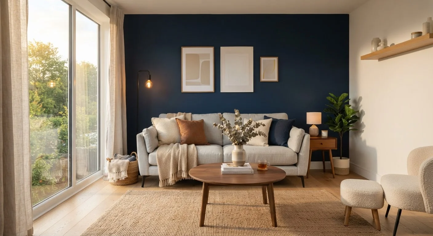
Accent walls also earn their place when the surrounding palette is calm and cohesive. A neutral room — whites, warm greys, sandy beiges — gains real energy from a single wall in a deeper or more saturated version of a complementary color. This is the context in which the technique genuinely earns its reputation. As a counterpoint to the matchy-matchy trap, see why matching everything holds your décor back.
When Accent Walls Fall Flat
Can look arbitrary without a clear focal wall
Applied to the wrong wall, the treatment reads as indecision rather than design — drawing attention to an unimportant surface for no visual reason.
Difficult to reverse with certain materials
Wallpaper, paneling, or stone treatments are significantly harder and more expensive to remove than paint, making a wrong choice costly to correct.
Can shrink already-small rooms
Bold or dark accent colors on a wall in a compact room reduce the sense of openness and can make the space feel oppressive rather than dynamic.
Competes with art and layered décor
A heavily patterned or saturated accent wall often fights with artwork, gallery arrangements, or complex textiles rather than supporting them.
Pattern choices can date quickly
Trend-driven wallpaper patterns and graphic textures that feel fresh today may look stale within a few years, leaving homeowners with a time-stamped room.
The most common failure mode is treating the accent wall as a shortcut to personality in a room that hasn't otherwise been thought through. Color on one wall won't resolve poor furniture arrangement, mismatched textiles, or inadequate lighting. If the room's foundation isn't solid, the accent becomes a distraction rather than an enhancement.
Rooms with multiple doorways, pass-throughs, or interrupted wall planes are poor candidates. A wall broken into three separate sections by two doorframes can't carry the visual weight an accent wall demands — the eye has nowhere to settle. The same problem applies to walls dominated by windows: the treatment competes with the window trim and natural light rather than complementing them.
Wallpaper and Paneling: Think Long Term
Pattern-based accent walls — geometric wallpaper, bold murals, shiplap — carry additional risk. They can date a room more quickly than solid color choices, and they're significantly harder to change your mind about. If you're uncertain about a long-term commitment, consider a paint treatment first. Paint is far more forgiving to adjust as your taste or furniture evolves.
Pattern-based accent walls — geometric wallpaper, bold murals, shiplap — carry additional risk. They can date a room more quickly than solid color choices, and they're significantly harder to change your mind about. If you're uncertain, consider a more reversible treatment like paint before committing to wallpaper or paneling.
Practical Guidance Before You Commit
Before deciding, spend time identifying which wall in the room already draws the eye. Stand in the doorway and notice where you look first — that's your candidate. If no single wall stands out, an accent wall is unlikely to manufacture that focal quality artificially.
Test your color choice at scale. A small paint swatch tells you almost nothing about how a saturated hue will behave across an entire wall. Paint a poster-board-sized sample directly on the wall and observe it at different times of day and under your room's actual lighting before committing to a full application.
Consider whether the treatment needs to do additional decorative work. A bold wall color competes with gallery arrangements and large artwork — if you're planning a gallery wall, a more neutral background often serves the art better than a saturated accent. Likewise, when deciding how wall treatments will interact with art and decor formats, understanding visual weight across formats helps you avoid visual overcrowding.
For bedroom applications specifically, restful color choices matter: a dramatic accent wall behind the headboard can work beautifully, but highly stimulating patterns or very dark colors may undermine a room meant for sleep. See bedroom décor guidance for more on balancing expression with restfulness.