
Why Paint Color Is More Than Decoration
Of all the decisions that shape how a room feels, paint color is often the most immediate and the most underestimated. Before a single piece of furniture enters the space, the walls establish a mood, set expectations, and signal how the room will be used. Color communicates — and understanding what it communicates puts you in control of your home's atmosphere.
This isn't abstract design theory. Color psychology describes the measurable ways that different hues affect mood, perceived room size, and even behavior. Restaurants have used warm reds to stimulate appetite for decades. Hospitals default to soft greens and blues because they're associated with calm and trust. You can apply the same principles at home, deliberately and affordably.
Color also doesn't work in isolation. It interacts with natural and artificial light, with the textures and tones of your furniture, and with the scale of the room itself. Understanding those interactions — not just picking a color you like from a chip — is what produces results that feel intentional rather than accidental. See how lighting plays into this in our article on natural and artificial light in interior design.
Warm, Cool, and Neutral: The Three Families of Paint Color
Warm colors — reds, oranges, yellows, and most earth tones — advance toward the viewer visually. They make walls feel closer, ceilings feel lower, and rooms feel cozier and more intimate. A warm terracotta in a dining room creates an inviting, convivial energy. A golden yellow in a kitchen can feel sunny and stimulating. The trade-off: warm colors can overwhelm in small or already-dark spaces.
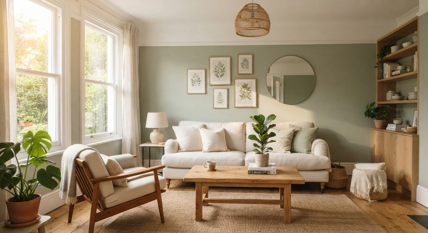
Cool colors — blues, greens, blue-grays, and soft purples — recede from the viewer, making spaces feel airy and open. They're strongly associated with calm, which makes them natural choices for bedrooms and bathrooms. A muted sage green reads as restorative; a deep navy anchors a space with quiet authority. Cool tones are generally more forgiving in smaller rooms because they don't visually compress the space.
Neutrals — whites, creams, grays, beiges, and greiges (gray-beige blends) — are the most versatile category. They don't assert a strong mood on their own, which is both their strength and their limitation. A well-chosen neutral lets your furniture, artwork, and textiles do the storytelling. The key detail most people miss: every neutral has an undertone that is either warm or cool, and choosing the wrong undertone for your light source can make a room feel muddy or off.
90 seconds
Time for color to form a subconscious impression
Research in environmental psychology suggests people form a color-influenced first impression of a space in as little as 90 seconds.
60–90%
Share of a first impression driven by color alone
Studies on consumer response to visual environments suggest color accounts for 60–90% of an initial assessment of a space or product.
$200–$400
Typical cost to paint an average bedroom (DIY)
Paint and supplies for a standard 12×12 bedroom typically range from $200–$400 when done by the homeowner, making it one of the most cost-effective interior changes available.
Finish Matters as Much as Color
Paint finish — the level of sheen — dramatically affects both how a color looks and how well the painted surface holds up in daily life. The main options, from least to most reflective, are: flat/matte, eggshell, satin, semi-gloss, and gloss.
- Flat/matte: Absorbs light, hides surface imperfections, and produces a sophisticated, velvety look. Less washable — better for low-traffic adult spaces than children's rooms or hallways.
- Eggshell: Slight sheen that's more cleanable than flat; a dependable all-around finish for living rooms and bedrooms.
- Satin: Noticeably reflective, durable, and easy to wipe clean — well-suited for kitchens, bathrooms, and trim work.
- Semi-gloss and gloss: High reflectivity that amplifies light but also highlights any wall imperfections. Typically reserved for trim, doors, and cabinetry rather than large wall surfaces.
A deep color in a matte finish feels moody and sophisticated. The same deep color in semi-gloss feels bold and almost industrial. Neither is wrong — but the choice should be intentional.
Applying Color Strategically Room by Room
Each room in your home serves a different function, and the most effective paint strategies align with those functions rather than work against them.
Living rooms are social spaces, so colors that feel welcoming — warm neutrals, soft taupes, earthy greens — generally perform well. This is also a room where a statement accent wall or a deeper hue on one surface can add interest without committing the whole space.
Bedrooms benefit most from colors that support rest: muted blues, soft greens, warm lavenders, and creamy neutrals all reduce visual stimulation. Our guide on bedroom décor and creating a restful space explores this in more depth alongside layout and textile considerations.
Kitchens and dining rooms can handle more energy — warm yellows, terracottas, and even punchy greens or navy accents can make mealtimes feel more vibrant and convivial.
Home offices benefit from colors that support focus without creating anxiety: soft greens, warm grays, and muted blues tend to be reliable choices.
Color doesn't operate in a vacuum — it's one layer in a broader decorating strategy. For a fuller picture of how to make design choices work together, see our overview of layering décor for a pulled-together look.
Start With One Pint Before One Gallon
Most paint manufacturers offer sample or trial sizes for a few dollars. Before purchasing a full gallon, buy a sample, apply it to the wall in at least two locations (one near a window, one away from it), and live with it for 48 hours across different lighting conditions. This small investment almost always prevents the more costly mistake of painting an entire room a color that doesn't work.
How to Test a Color Before You Commit
The most reliable way to choose a paint color is to test it on your actual walls — not a chip, not a phone screen, and not a neighbor's wall in a completely different light. Paint stores sell small sample sizes specifically for this purpose.
Paint a swatch at least 12 inches square directly on the wall (or on a large piece of white poster board you can move around). Observe it at different times of day — morning light, afternoon light, and evening under your artificial lighting. A color that looks fresh and airy at noon might read greenish or gray by lamplight. The paint will also look slightly different once dry than when wet, so allow it to cure fully before making your final call.
Also consider how your paint choice interacts with fixed elements you're not changing: flooring, tile grout, existing cabinetry, and even the color of surrounding rooms. Paint is one of the easiest elements to change, but testing before committing saves both time and money.
For guidance on how textiles and soft furnishings interact with your wall color, explore how rugs, curtains, and throw pillows transform a room.